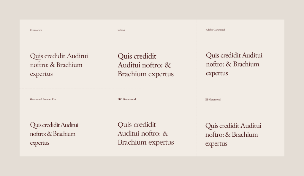
Exploring the Beauty of Garamond: A Guide to its Many Variations
Knowing your typefaces & fonts can help you set the right mood and hitting the right tone with your design.
Take Garamond for example, a typeface born in the 16th century but still used often and worldwide. Apple used it for the first few decades of their existence.
So when you’re looking for an old, historical or classical look & feel, Garamond might be the right typeface.
The thing is though, there are so many versions of Garamond! And they all look a bit different! What is the difference, and which should you pick?

So many Garamond versions!
A quick google for “Garamond .otf download”, soon reveals the truth: there are many versions of Garamond. Too many.
- Garamond Premier
- EB Garamond
- Cormorant Garamond
- ITC Garamond
- Adobe Garamond
- Sabon (Based on Garamond)
To name a few.
What is the difference? And which should you pick?
If you’re simply looking for the difference, take a good press on this button and you’ll scroll down a bit.
Some background stuff you need to know when working with Garamond
I spent a few hours researching this bad boy. Main conclusion? All typefaces I mentioned earlier are all derived and interpretations of the real thing.
Makes sense actually, because the original Garamond was punch-cut, and afterwards printed using a metal letterpress. Of course all digital versions have to be interpretations rather than the real thing.
And each ‘interpreter’, had his own view, ideas and vision on how to approach this. And therefor several versions have emerged during the last century or so.

Which Garamond version to choose?
This depends on the vibe you’re after.
This is a brief summary, but I’ll go into depth with lots of images later on.
Looking for the typical classical old style? With humanist elements and imperfections? Go for Garamond Premier Pro. In my opinion this looks most like the original Garamond and has quite some options, ranging from Display, to Caption to Semibold Subhead.
If you’re looking to mix old and new, and looking for a modern approach to Garamond, ‘Cormorant Garamond’ might be a good choice. Much sharper serifs, but in some situations this might work.
If you’re looking for a free version instead of Garamond Premier Pro, go for EB Garamond. These two look very similar!
Adobe Garamond is basically a predecessor of Garamond Premier Pro, so let’s ignore that one.
ITC Garamond Pro: Personally not a fan. It has much rounder O’s and E’s, and a much taller x-height. Looks like a different typeface to me.
Sabon:All versions above share a certain imperfections, probably based on the effect which typesetting had back in the days: ink flowing and edges not being very sharp or straight. If you’re looking for a cleaned up version which also looks really nice, Sabon is a good choice.


Summarized: which Garamond version to choose
Garamond Premier Pro: Best interpretation of the real thing. Humanist look & feel.
Sabon: Good looking, cleaned up and straightened out interpretation.
Cormorant Garamond: A free font. Much sharper edges. But works great for headings if you want to give it a modern touch.
Fun facts about Garamond
Claude Garamont’s name was actually spelled with a t instead of a d.
Also, much of the interpretations mentioned above are often based on the work of Jean Jannon, who’s work has been mistaken for that of Claude Garamont for centuries.
Additional reading if you’re interesting in typography
Receive a pretty email when I got some new knowledge or inspiration for you?
This site uses Akismet to reduce spam. Learn how your comment data is processed.


Leave a Reply