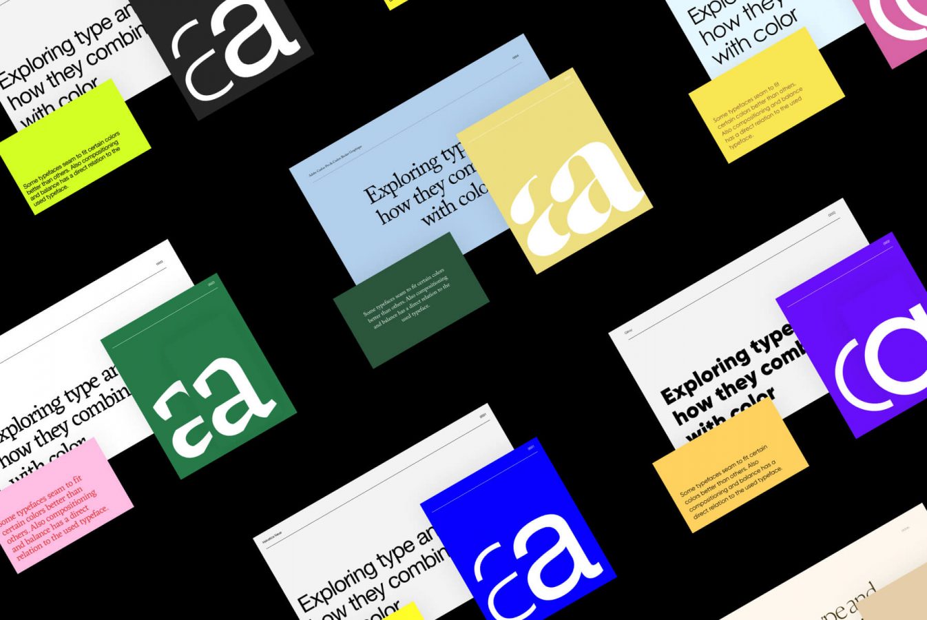
How to complement typography with the right colors
“When a flower doesn’t bloom you fix the environment, not the flower”
Alexander Den
The same is equally true in design. A font, a color, or a composition may look awful, but perhaps there is nothing wrong with the design element itself, but the environment simply isn’t right yet.
What this means for designers is this: we need to know the right environment for each flower design element.
Below several examples to illustrate this, in which I attempted to mix a color palette with the right typography, making them flourish & thrive.
Example 1
In the above-left example, I combined primary colors with Helvetica and below-average sized whitespace. These things match because Helvetica and primary colors come from the same time, a time where Swiss design was a thing.
…their style, which was called the International Typographic Style at the time, was guided by the ethos that design should be as invisible as possible.
The right version contains Gilroy, but with the same whitespace and colors. Gilroy is a much more friendly typeface in my opinion. It’s rather geometric but more round and thus friendly in a way. It’s a typeface often used in finance designs; serious yet friendly and open. An example below.
I think we can agree that in the left version the elements are much more in sync with each other. The right font in the right environment.
Example 2
In this second example, I’ve picked an environment much more suited for Gilroy. Depth and a more fun color palette, matching the friendly aspect of the typeface.
In the right example Helvetica comes across as a bit cheap, Gilroy is obviously the better choice here.
Example 3
The below example contains Adobe Caslon Pro & Open Sans. The left version is a more coherent set: matching a serif humanistic typeface with some classical Old Dutch colors.
Example 4
Used typeface: Eczar. A serif typeface, at first you might be tempted to mix it with more classical & traditional colors. But at the same time, the font is a bit quirky and feels like a contemporary typeface. So a subdued green (fits the traditional element) combined with pink and vibrant red (to complement the quirky aspect of the font) mixes with it perfectly.
Example 5
Below we’re using Canela. As described by the owner, it’s a very graceful typeface. The regular version of the typeface also feels rather fragile, making it a good fit with pastel colors. A combination often found in fashion or personal care products. Therefore I combined this typeface with soft earthy colors.
Example 6 & 7
Summary, Conclusion & Next Steps
Find the right environment for the colors or typography you are about to use. Open Sans might look great on a Dribbble image, but terrible in your design, due to the incorrect use of other design elements such as color or composition.
As for the next steps: it will be interesting to discover if elements always should be a coherent set in order to appear visually pleasing. What if we combine elements that have completely different characteristics? In the above examples that didn’t work out too well, but what are the exceptions?
Comments (4)
-
-
Hi Brice, are you talking about the weight of a color and of a font being equal? Could you clarify your question?
-
-
It’s awesome designed for me to have a website, which is helpful designed for my knowledge.
thanks admin
Leave a Reply Cancel reply
This site uses Akismet to reduce spam. Learn how your comment data is processed.
Brice
January 19, 2021Do you think the experimental comparisons could benefit from same weights? I think with the contrasting weights it could affect the overall result of pairing.