10 Most used typefaces and how to recognize them
Let’s face it: as designers, we expect from ourselves that we can recognize typefaces. We should at least be able to keep Arial apart from Helvetica, right? But can we? And ideally, we want to recognize more typefaces than just Helvetica.
This post started as an educative endeavor for myself but I realized it might be helpful for you too. The result: an overview of the 10 most used typefaces and how to recognize them.
Enjoy! If you have any additions, let me know!
(I’ve added a fun little test at the end to test your knowledge 🙂 )
Helvetica
There are a bunch of typefaces like Helvetica. Univers. Akzidenz Grotesk. Arial. The Helvetica Neue and Now variants. I’m probably forgetting a few. We won’t go into most, except for the difference between Arial and Helvetica. Because Arial is ugly. Helvetica isn’t. So take note.
One thing to keep them apart is the recognizable horizontal cuts in Helvetica. Arial contains a lot of angled elements.


Arial
Let’s not speak of this hideous abomination. 😉


Gotham
“The Gotham typeface was initially commissioned by GQ magazine, whose editors wanted to display a sans-serif with a “geometric structure” that would look “masculine, new, and fresh” for their magazine.”
“Since creation, Gotham has been highly visible due to its appearance in many notable places. This has included Barack Obama’s 2008 presidential campaign,”
By now, the font is used quite often.
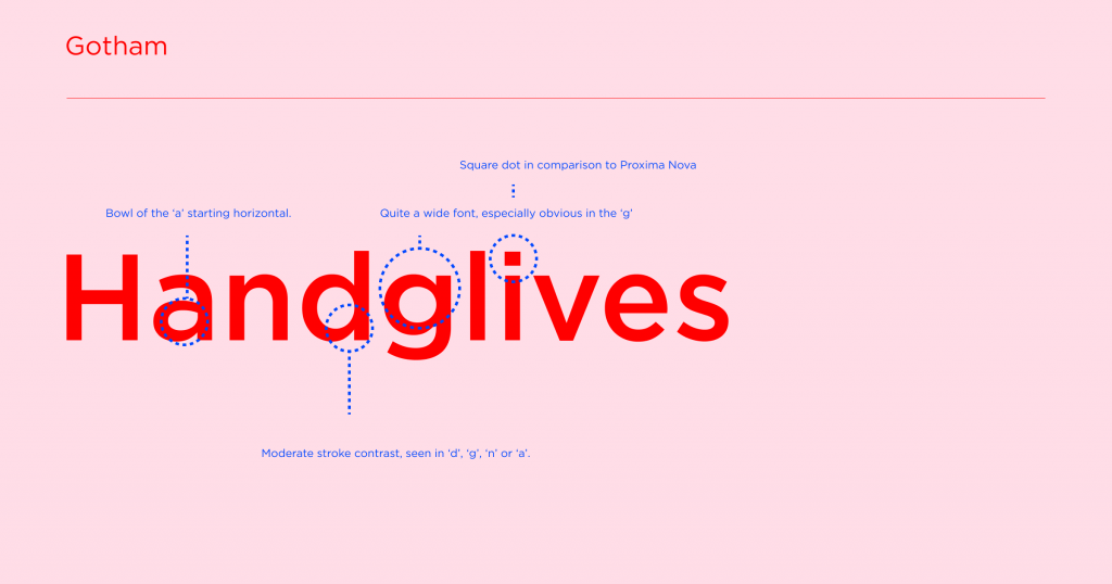
It is kind of easy to recognize, but it comes close to Proxima Nova. The square dot on the ‘i’ and the moderate stroke contrast, seen in ‘d’, ‘g’, ‘n’ or ‘a’, is helpful to keep them apart.


Proxima Nova
Personally not really a fan of this typeface, especially because of the large stroke contrast seen in the ‘a’, ‘d’, and ‘g’.


Montserrat
It’s been used on 15 million websites in the last decade, so perhaps I’ve grown tired of it. I’m not sure what it is, but for some reason, I’m not a big fan of it.
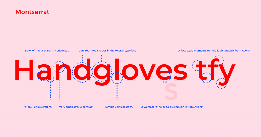
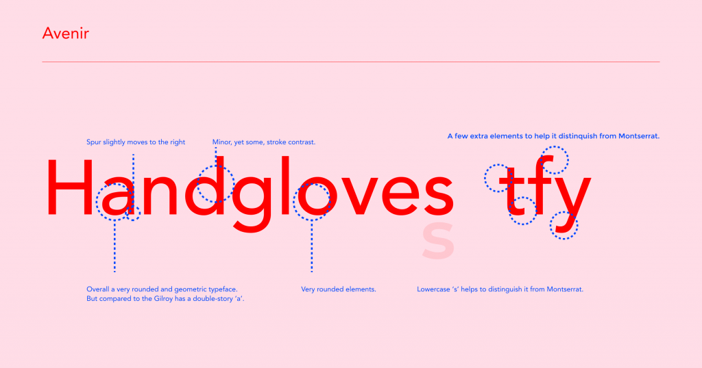
It has quite a tall x-height, which is one of the things to keep it apart from Avenir, a typeface that is very similar. Most people won’t be able to keep them apart (I did research: I asked my wife).
(The capital R and P help you to distinguish this one. The vertical balance sits quite low, making it look somewhat retro-like).
Images below help you to keep them apart. I’ve added the ‘tfy’ here, which are characters that are recognizable compared to Avenir.


Avenir
An impressive font in my opinion, and quite popular as well. Montserrat is either too thick when used in Regular or too thin when used in Light. The Avenir’s stroke-width is much more pleasant.


Gilroy
Extremely popular on Dribbble, a very friendly geometric modernist typeface. Recognizable by its round look, single story ‘a’ and low stroke-contrast, and angled lines in the lowercase ‘e.’


Futura
Recognizable by its somewhat narrow characters and small x-height. But most of all: the pointy elements in the ‘v’ and ‘w’.


Didot
Recognizable by its straight serifs. Nowadays, you might not consider this worth noting, but in its own time, it was a very bold design choice. Very often used for expensive brands.


Bodoni
Used for expensive brands as well is Bodoni. The easiest way to keep this one apart from Didot is the humanistic qualities: these refer to the organic way the stems move into the serif (referring to some characteristics occurring when writing by hand).


Test your typeface skills with a little test
I’ve created a test in Figma that help you put your knowledge to the test. Right now it contains these 10 typefaces, but perhaps I’ll add more in the future. Perhaps we can recognize all fonts we see around us, some day?
Receive a pretty email when I got some new knowledge or inspiration for you?
Comments (2)
Leave a Reply Cancel reply
This site uses Akismet to reduce spam. Learn how your comment data is processed.


Pingback: Which Garamond Typeface to Pick!? So much choice! - Deesignre
January 3, 2024