For some reason our brain has been wired to like looking at nature. It’s easy Instagram-able like-promising content.
I thought, why not let nature be our teacher for today and see what we can learn from nature about creating pretty color palettes?
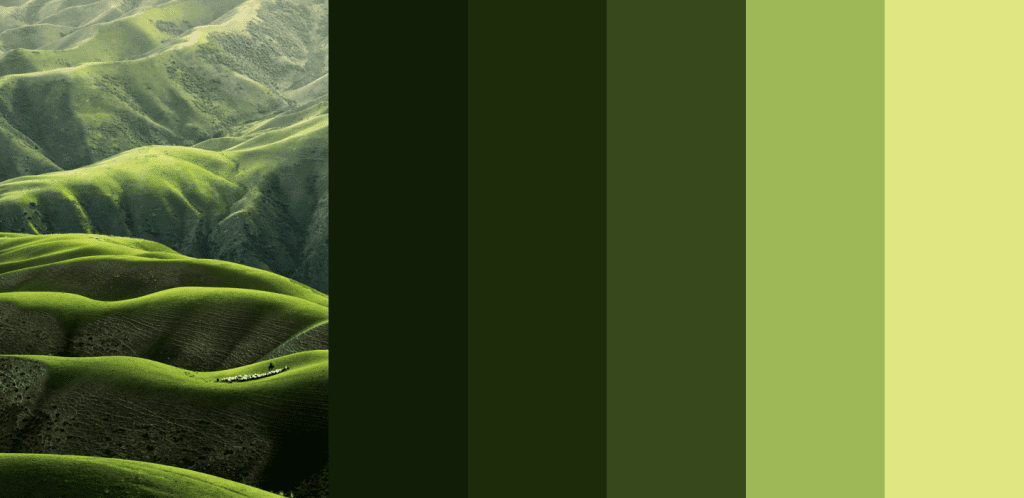
I picked a few random Unsplash nature images to demonstrate a few learnings.
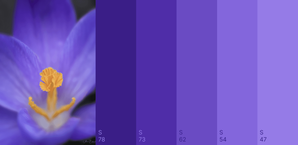
Dark colors are more saturated than light colors
The first thing I noticed was that dark colors are more vibrant, and more saturated, compared to the lighter shades in a palette.
Perhaps this comes naturally to you when setting up a color palette, or maybe this trick helps you make a few tweaks to a palette you’re working on to make it slightly prettier.
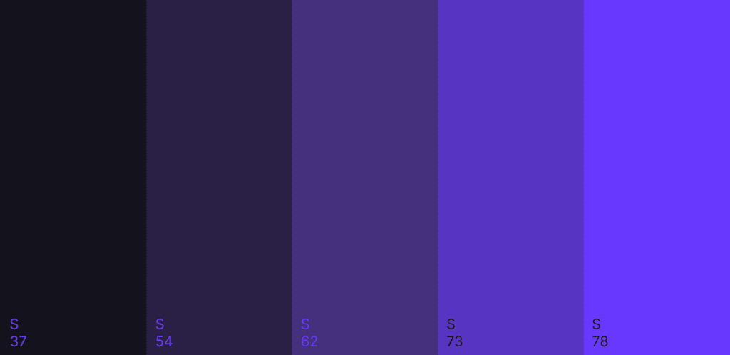
Can light color be vibrant?
If we do the opposite and make dark colors less saturated, this is what happens.
If we change the brightness value and saturation value.
It’s a creative direction though, I must admit. It’s kinda giving me midnight neon vibes. Yet it’s much less aesthetically pleasing, especially due to the three middle colors.
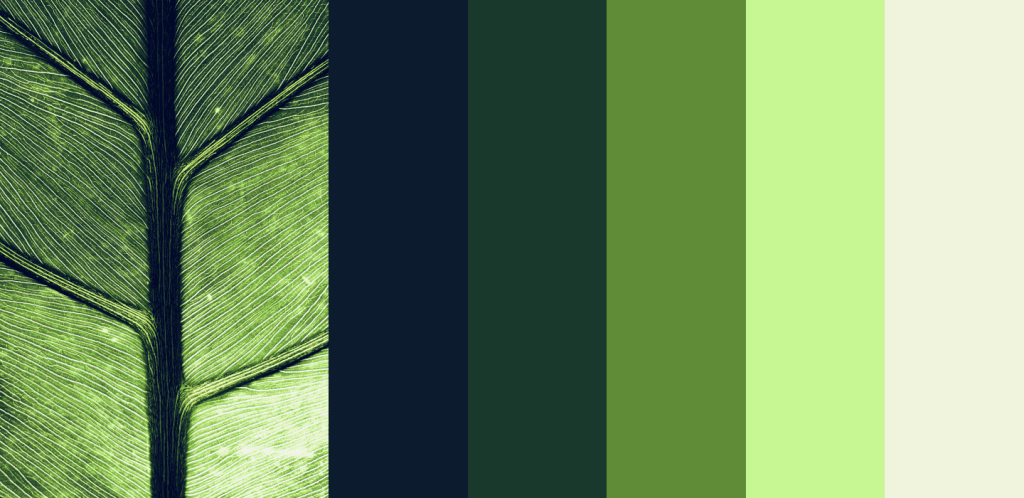
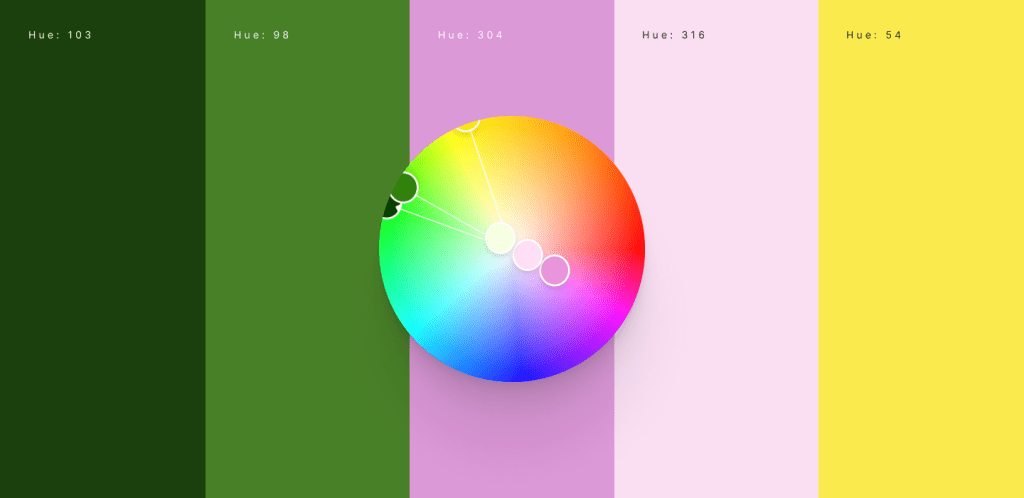
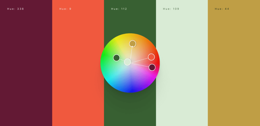
The brightest colors are closer to yellow
In research from a few years ago, I found that the brightest color in a palette is often closer to yellow.
In preparation for this article, I was happy to find similar patterns in nature.
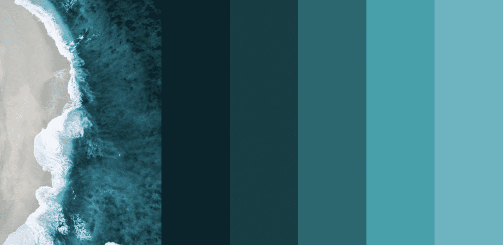
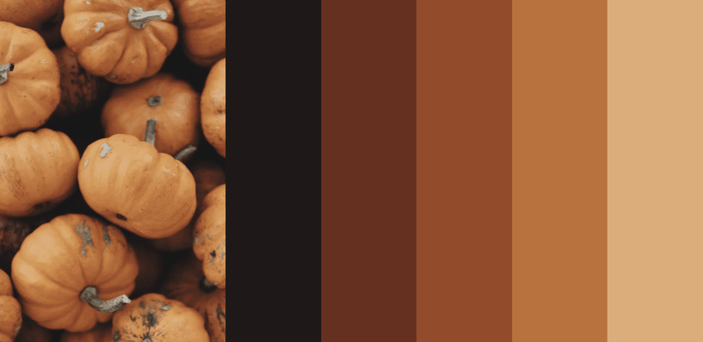
Below are a few examples in which the brightest color ‘contains more yellow’ compared to the rest of the palette.
The brighter the more yellow a color contains.
The brighter the more yellow a color contains.
The brighter the more yellow a color contains.
The entire story is a bit more complex than this, but to keep things simple for today: if your creating a analogous palette and working from dark to light, try moving the lighter color towards yellow.
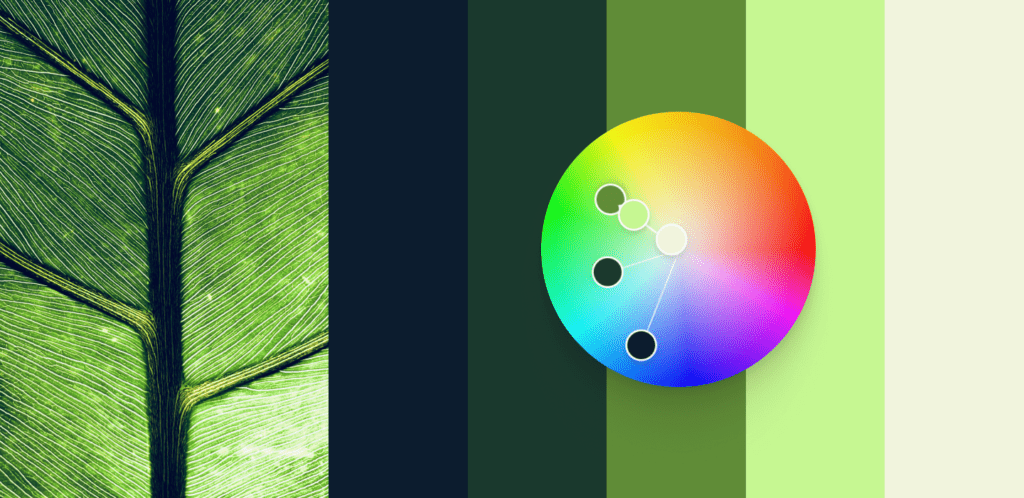
In all three examples above, the bright colors contain ‘more yellow’.
In other words: if you place the colors on a color circle, the light shades are closer to yellow than the dark shades.
Notice the position of the bright colors versus the dark colors.
Putting knowledge into practice
I love playing around with Adobe Color, which allows you to create a color palette and visualize it on a color circle.
It’s good practice to play around.
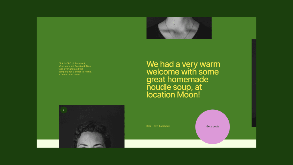
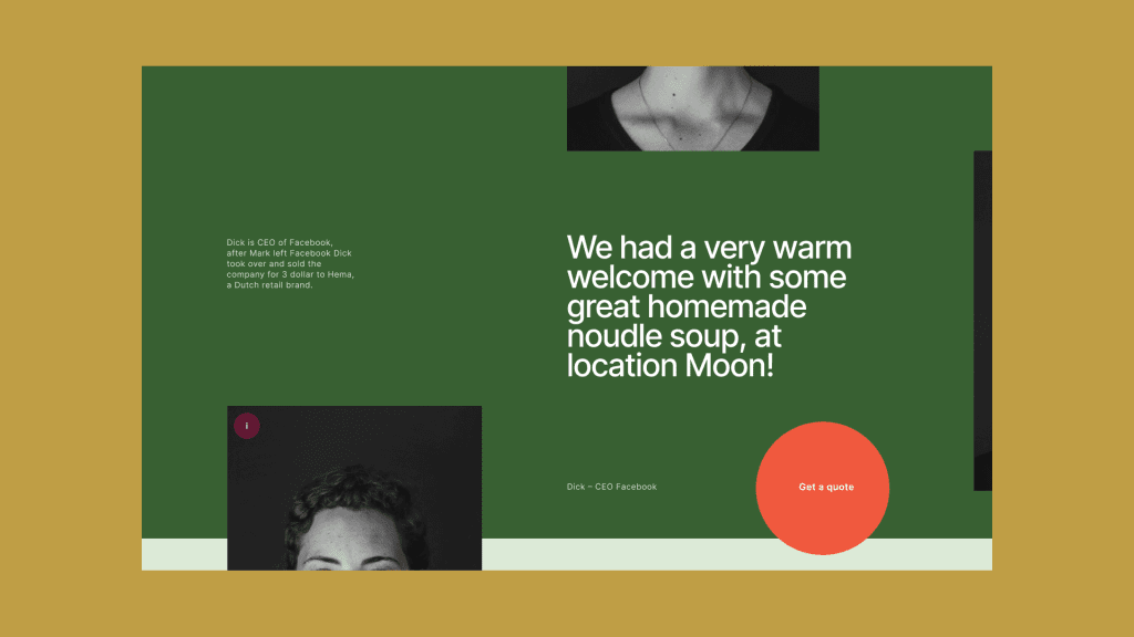
Throw your generated palette in a simple UI design to discover how it all comes together.
In the examples above we applied the first lesson of making the dark colors more saturated than their light counterparts.
Regarding the second lesson about the light color being more yellowish: both palettes contain two small analogous color palettes in which the light color is indeed more yellow than the dark shade.
Final words
I hope you learned something today. I recommend you to play around at Adobe Color and experiment with these lessons.


Leave a Reply