The Avant Garde Typeface: A Forbidden Fruit
It was almost 8 years ago that I worked with the beautiful Avant Garde typeface for the first time. I knew near nothing back then on how to use the Avant Garde typeface properly.
Little did I know back then about readability and legibility. Little did I know about how repetitive letterforms, like present in Avant Garde, can hinder readability. Little did I know that a small x-height, like present in Avant Garde, make text harder to read. Little did I know about the intentions of the type-designer who made the Avant Garde typeface. And thus, as a junior designer back then, I made some terrible type choices.

To help you prevent this and to help myself prevent this in the future with different typefaces, I’ve been taking some deep-dives into certain typefaces to get to know them better and learn how to make them thrive in a design.
First up, was the Avant Garde typeface.

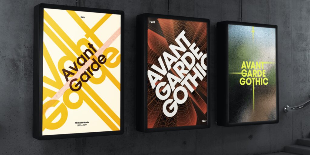
Avant Garde is actually quite a pretty typeface. The beauty lies in its repetitive shapes and geometric forms. There are very few typefaces I know that have this amount of repetitive strokes and shapes. This adds a certain rhythm, a certain cadence, which turns it into a piece of art, like a logo design, rather than an ordinary typeface.
Additional reading: The difference between a font and a typeface

But what do you do, when the creator disproves of it’s use by most designers over the past decade?
Ed Benguiat, a type designer and friend of the creator Herb Lubalin, puts this into words by saying the following about this masterpiece: “The only place Avant Garde looks good is in the words Avant Garde.”
In summary, it was never intended to be used anywhere else besides the magazine Avant Garde. But due to its rising popularity in the 1970’s a full typeface was made based on its usage in the magazine it belonged to.
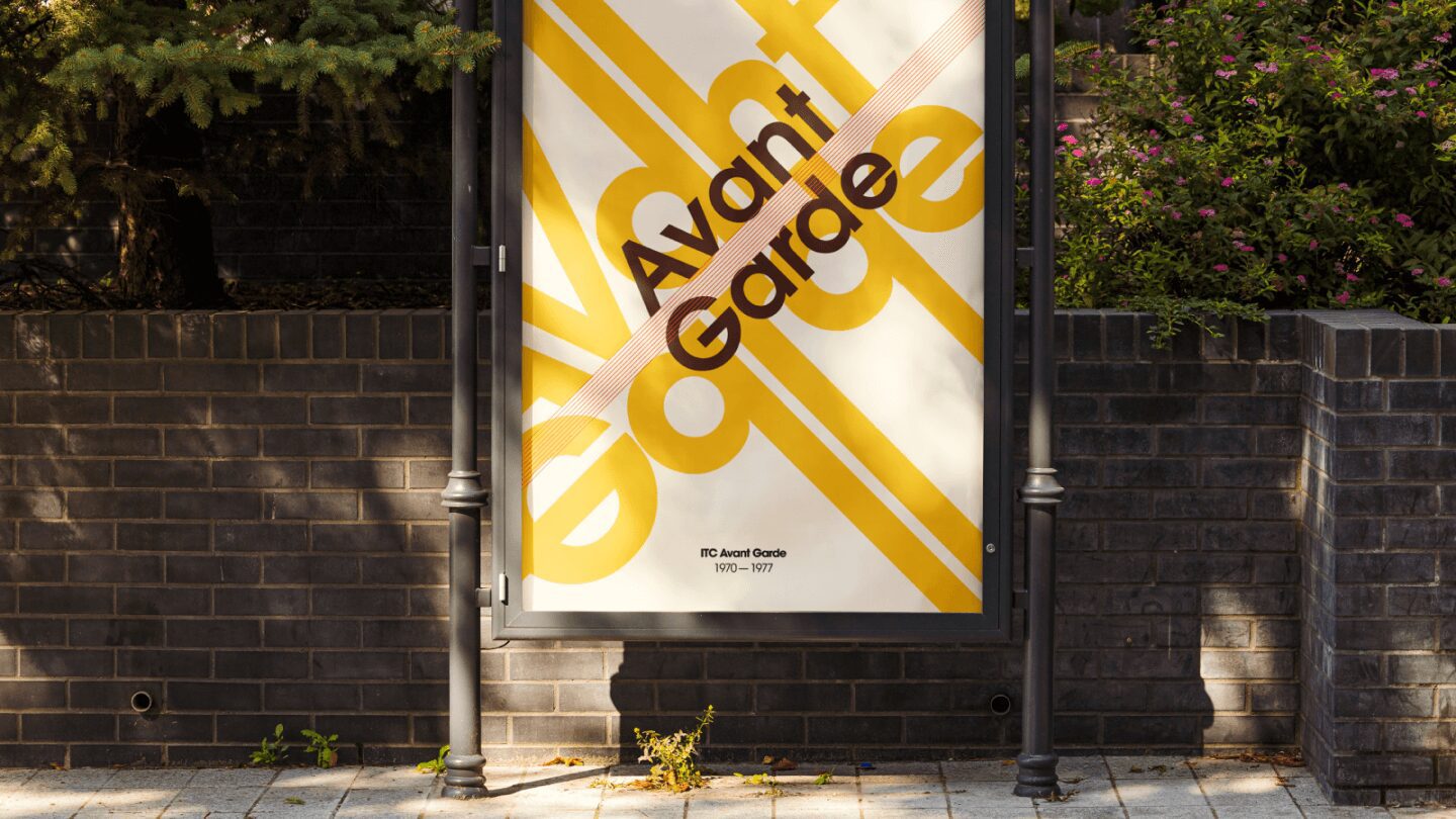
Avant Garde thrives and shines in all-cap usage, or in ridiculous large sizes, and by making use of its many available ligatures (a combination of letters that together look visually different).

But like I mentioned before, Avant Garde contains a lot of features that hinder legibility.
- No or little difference in shapes. The o looks like the a or e for example. Or the t comes close to the i or l.
- Small x-heights
Read more about legibility here if you’re curious as to what details make a font easy or hard to read.
In other words, avoid using Avant Garde as body text or in other small sizes, and you’re good to go.
It was not intended to be used as such, but also is terrible to read from a professional perspective.
If you use it, use it large.
Receive a pretty email when I got some new knowledge or inspiration for you?
Comment (1)
Leave a Reply Cancel reply
This site uses Akismet to reduce spam. Learn how your comment data is processed.


Stef
January 3, 2024Boy, we made some mistakes then 🙂 nice post again