How to choose and combine colors – A thorough analysis of color combinations. -Part 1
A good or bad color combination can make or break your design. Even if your UX is spot-on and the UI pixel perfect, if the color combination is awful, your design won’t be a delight to interact with.
If I’m completely honest, most content on combining colors or choosing colors suck. The basic color theory didn’t get me — or you — anywhere.
“Complementary colors are the key to successful combinations?’ Well, f*** that, I can think of a million green-red combinations that look like shit.
Yes, I was a little frustrated that I couldn’t find anything more useful out there than these generic tips. I knew there had to be more comprehensive advice for good color palettes.
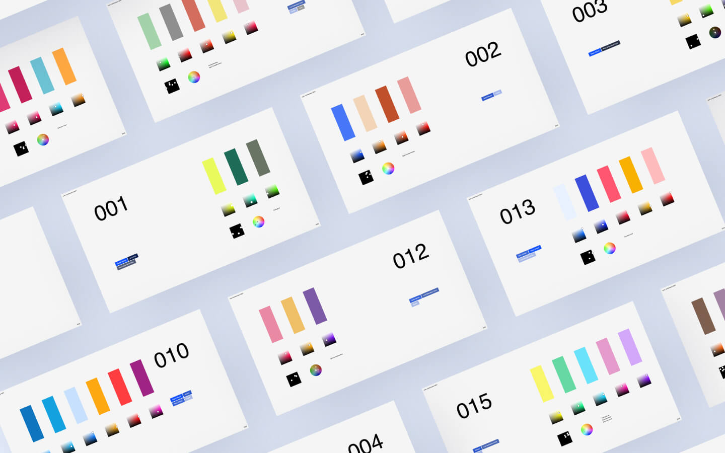
I set out to define a set of guidelines on how to choose and combine colors.
How? By spending hundreds of hours looking at, analysing and summarizing color scheme’s I found all over the digital world.
My approach for defining good color combinations
The approach for finding good color combinations was rather easy.
Step one was to define color categories. Like ‘pastel’, ‘dark and saturated’, ‘dark and desaturated’, ‘light grey’ and so on. In other words, the exact tone of the color.
Step two was to collect highly appreciated designs from the online design community, like Dribbble, and define and map out which colors, and their category, were being used.
The main goal was to find patterns. Something more than the usual and superficial advice to “combine complementary colors” had to be out there.

A new approach to defining colors: color categories.
My first step was to create color categories. Why? Because most color theories speak of colors as being a single thing. For example, red. Rather than all the thousand different shades of red that are possible.
You most likely have come across to the advice of combining complementary colors, e.g. purple with yellow.
But which purple? Which yellow?
I couldn’t find anything like this online. But what I needed was to devide all colors in different categories. Pastel, Dark with high saturation, dark with low saturation, light almost grey-like, and so on.
I was able create to following overview of color categories. Which I was able to use to draw a shitload of conclusions.

Main conclusions & guidelines for an amazing color palette
1. A well-crafted color palette lives in harmony with each other
In a pleasant color palette, all color seem to live in harmony with each other. Each color is unique. Not just in terms of the hue value (whether it’s blue or orange) but also in terms of saturation (is it almost gray or very vibrant?) & brightness (is it closer to white or black?).
It’s like a well aligned team where everyone has their own role.
After tagging each palette with the earlier mentioned 13 color categories, I noticed there are rarely two of the same ‘color-types’ within the same palette.
Let’s inspect the following palette as an example, to make this a little clearer.

The white dots in the second row of blocks, represent the position of the adove colors on the HSL color spectrum.
As you can see each color has its own ‘role’, or place.
- Green is pretty desaturated compared to the other colors.
- Grey… well… it’s just grey. But it is the only grey.
- Red is sitting in the middle as a somewhat darker & desaturated color.
- Yellow is the only vibrant color. Sitting at the very right of the HSL color spectrum.
- The pink color is the only ‘bright’ color and is placed relatively close to white.
In other words, all a little different, not competing with each other. Some dark, some light, some subdued, some vibrant, and so on.
Two examples below on how to apply this.


2. Complementary is overrated.
In the 15 designs I inspected, I expected to come across a lot of complementary combinations. Because this is the first thing you learn from color theory and is the most well-known combination.
As the title already gives away, I have not come across any complementary colors.
These were the most common schemes I did find:
- Split-complementary (almost opposite of each other on the color circle)
- A new pattern I call the “K-Pattern” or “Triad-Variation.” I’ll come back to this later.
- A 90-degree combination. I’ll also explain this later.
- A mix of schemes, such as complementary combined with any of the above
Interesting because the 90-degree choices and the K-Pattern were new to me, and were not documented anywhere else.
Below are three examples of the 90-degree palette and the k-pattern. The patterns can be recognized in the color wheel in the second image.


Take a closer look to the color circles above and the patterns you notice there.
K-Pattern & 90 degree pattern.
Perhaps there is an official name for this pattern I don’t know about.
But it seem to start with a split-complementary combination, combined with a analogues color scheme (colors lying next to eachother on the color wheel). Or you could call it a variation of the triad color scheme (a triangle shape on the color wheel).
To my knowledge: not a known color scheme. But here are four steps on how to achieve this palette.
- Pick two split-complementary colors. Make them both of a different category. Dark & Light or Vibrant & subdued. Dark Pink/Purple with Bright Yellow, for example.
- Give one of the two colors a second color, darker or lighter (at least not of the same category).
- The fourth color is somewhere in the middle of the two first colors. Again, of a different category.
Two examples below. Do take your time to inspect the HSB values below the images to understand color harmony: all colors are in a different category here.


3. Combine dark with light or subdued with vibrant.
If we continue with the first example of this blog (see image below) we see a repeating pattern emerging.
Dark is often combined with light. And more often than not the dark & light color are often (split) complementary to each other.
Let’s take a look at the following example:


4. A secret to analogous color schemes #1
My personal favorite discovery.
As you might have noticed in all the previous examples, a 5-set palette often consists of 2 of 3 colors that are near each other on the color wheel. Also called an analogous palette.
This 2 or 3 color-combo often forms the base for your 5-set palette.
A good understanding of how to set this up is thus essential. What I discovered will be very useful in your everyday design job.
The darker colors are more saturated (e.g. Saturation = 100), while the lightest color is less saturated (e.g., Saturation = 50). Take a look at the Saturation and Brightness values in the example below. Why does this work? If you pick a shadow color on a real photo, you will notice the shadow is more saturated than the light spots of that same color. Take a look at the HSB values of the colors below.

4. A secret to analogous color schemes #2
Magenta, yellow, and cyan are perceived as brighter colors. Yellow with 100% brightness and 100% saturation looks much brighter than blue at 100% brightness & saturation.
So if you want to create a dark-to-light set, move your next color (on the color circle) towards the nearest ‘optical’ bright color. The light blue color in the example above is more closely to Cyan, and the light brown color is positioned more closely to Magenta.
In the image below, I started with purple. Magenta was pretty near, so with each step, I moved more towards magenta, enhancing the perception that each color is a lot lighter.

Summary
The two keywords here are Hierarchy and Harmony. Creating enough difference between each color, to ensure they don’t compete with each other. While too much difference will remove the harmony.
The already well known color schemes, such as split-complementary, triad, and so on, do prove valuable, but not on their own. Hierarchy and harmony need to exist with that scheme. Exactly this part is, in my opinion, missing from current color theory.
And last but not least, we discovered several other color schemes that were, at least to me, new. A simple 90 degree 3 color combination, or the 4-5 color K-Pattern might turn out great as well.
Further reading on how to choose and combine colors well
I’ve continued my search into this topic and made a part 2. Which is briefer, and summarizes most findings very visually. Read it here!
This site uses Akismet to reduce spam. Learn how your comment data is processed.


Leave a Reply